FINZ Resort
Finz Resort, situated on the scenic Shuswap Lake, has recently refreshed its branding suite by introducing a new color palette while retaining the much-adored Fin Fish Logo Mark with minor updates. This rebranding effort is expected to elevate the resort’s visual identity and appeal to a wider audience.


Colour Palette &
its Purpose
Our all-new colour palette is designed to bring out the beauty of the resort – darker blues and greens will seamlessly blend into the lake, while brighter colours will be used as accents to give an extra touch of excitement to our experience.
Light Blue
Dark Blue
Light Grey
Off White
Light Green
Dark Green
Logo Marks | Primary Logo

Logo Marks | Fin
Swank Creative Inc. successfully revamped the outdated Fin fish icon by minimizing the number of colors while retaining its original essence, resulting in a fresh and contemporary look. This update allows the icon to remain recognizable and familiar while bringing a modern touch to the brand identity. Even adding a Little Fin for items directed at kids events and promotional items.

Alternative Logo Marks
We wanted to demonstrate versatility by creating three variations of the Finz Logo, each in a square, rectangular, and circle format, to cater to different branding needs and applications. These variations enable the logo to be easily adapted to different mediums and platforms while maintaining consistency and cohesiveness across all touchpoints.


Refreshed & Refined
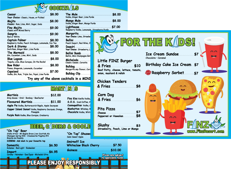
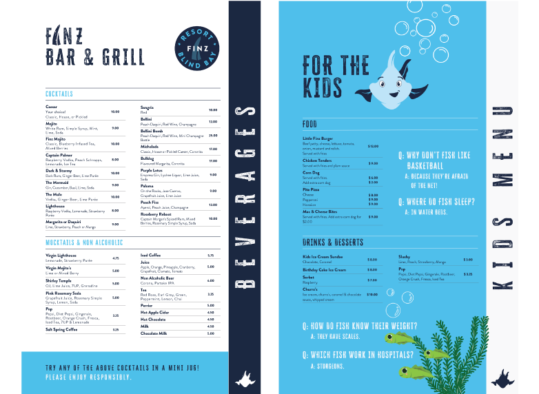
Swank Creative Inc. revamped the Finz Resort menu by opting for cleaner fonts and reorganizing the information for better readability, while incorporating strong calls to action for add-ons and feature menu items. The new menu design also provides a more engaging experience for children, resulting in an overall improved dining experience for guests.